
.svg)
The Real State of Helm Chart Reliability (2025): Hidden Risks in 100+ Open‑Source Charts
.png)
tldr
- Prequel's reliability research team audited 105 popular Kubernetes Helm charts to reveal missing reliability safeguards.
- The average score was ~3.98/10
- 48% (50 charts) rated "High Risk" (score ≤3/10)
- Only 17% (18 charts) were rated "Reliable" (≥7/10)
- Key missing features include
- Pod Topology Spread Constraints (93% absent)
- PodDisruptionBudget (74% absent)
- Horizontal Pod Autoscalers (75% absent)
- CPU/Memory resource requests/limits (50–60% absent)
- Several 0/10 charts were DaemonSets (e.g., Fluent Bit, node‑exporter, GPU plugins) where PDB/TopologySpread/HPA/Replicas are generally not applicable.
- It’s important to note that a low score does not necessarily mean the software itself is bad; rather, it means the default deployment setup might not offer high reliability standards.
- We recommend end users patch missing controls via values.yaml or via helm overlays.
- Users should use continuous reliability protection tools like Prequel to identify missing safeguards and monitor for impact.
.png)
Introduction
Reliability is one of the main reasons teams adopt Kubernetes, it promises self-healing workloads, automated rollouts, and consistent recovery across environments. However, it is easy to undercut these advantages. A Helm chart packages the Kubernetes manifests that define how an application is deployed. When those charts omit best practices or include misconfigurations, the resulting deployments can become unreliable.
This report presents a comprehensive reliability audit of 105 popular Helm charts. The goal is to identify how well these charts adhere to known best practices that improve uptime, resiliency, and safe operations in Kubernetes environments.
What do we mean by “reliability” in this context? Essentially, we looked for Kubernetes manifest settings that help applications survive disruptions, autoscale to handle load, and avoid common failure modes. These settings correspond to widely recommended practices such as configuring PodDisruptionBudgets, spreading pods across zones and nodes, defining CPU/Memory requests, enabling Horizontal Pod Autoscaling with sensible minimums, etc. When these features are properly set, applications are better protected against outages (both planned and unplanned).
.png)
How did we collect the data?
The Prequel Reliability Research Team (PRRT) evaluated a total of 105 Helm charts, selected to cover a broad range of popular open-source applications and infrastructure components. These include charts for observability tools (e.g. Grafana, Prometheus), databases and storage systems (e.g. MySQL, Elasticsearch), networking and security add-ons (e.g. NGINX Ingress, Calico), messaging systems (e.g. Kafka, Pulsar), machine learning tools, and more. Each chart was analyzed using both its default manifests and a minimal “HA‑capability” render to reveal what’s supported when scaled.
What was our criteria?
We checked each chart against 10 key reliability criteria. Each criterion corresponds to a best-practice configuration that improves reliability. Each chart was rendered twice: once with default values (out-of-the-box) and once with a minimal “HA-capability” override (e.g., setting replicaCount/replicas ≥ 2 and enabling autoscaling/HPA when available). Capability-style criteria (PDB, TopologySpreadConstraints, HPA) are considered “preseConsider writing an overlay chart or a wrapper that adds missing pieces.
Note: Daemonset(DS)‑based charts do not use PDB, TopologySpreadConstraints, HPA, or Replicas in the same way as Deployments/StatefulSets. For DS we emphasize CPU/Memory Requests/Limits and Liveness. Interpret DS scores with this in mind.
The specific criteria audited were:
- PodDisruptionBudget (PDB) – Does the chart define a PodDisruptionBudget for its pods? A PDB ensures that a minimum number of pods stay up during voluntary disruptions (like node drains or upgrades), so that maintenance events don’t accidentally take down the entire application[2].
- A PDB limits how many pods can be offline at once, preserving availability[3].
- Topology Spread Constraints (N/A for DaemonSets (one pod per node; spread is implicit)) – Does the chart use topologySpreadConstraints to spread replicas across nodes/zones? This feature prevents all pods from landing on the same node or zone. By distributing pods across failure domains, it reduces the blast radius – if one node or AZ goes down, it won’t take out every replica[4].
- Topology spread constraints thus improve resiliency in multi-node or multi-zone clusters.
- Horizontal Pod Autoscaler (HPA) (N/A for DaemonSets (HPA does not scale DS) – Does the chart include a HorizontalPodAutoscaler resource (or support enabling it via values)? An HPA will automatically adjust the number of pod replicas based on workload (CPU, memory, or custom metrics)[5].
- This ensures the application can scale out to handle surges in demand and scale back down to save resources, thereby preventing overload and maintaining performance during peak loads. In practice, an HPA with minReplicas ≥ 2 will ensure redundancy.
- CPU Requests – Do the pods have CPU requests set? A CPU request reserves a certain amount of CPU for the container. Setting requests is vital because it lets the Kubernetes scheduler know the pod’s needs, and prevents scheduling too many high-demand pods on one node.
- Without CPU requests, pods might be squeezed onto a node without guaranteed compute, leading to unpredictability. We treat absence of CPU requests as a reliability risk.
- CPU Limits – Do the pods have CPU limits defined? CPU limits cap how much CPU time a container can use. This is important to prevent a single pod from monopolizing the CPU on a node.
- Left unchecked, a misbehaving pod can starve co‑located workloads (including system components), hurting overall cluster stability.
- Note: The use of CPU limits is debated; limits can introduce CPU throttling under load (sometimes even when usage appears within the configured limit), which may cause latency spikes. We still treat the presence of reasonable limits as a reliability factor because they improve predictability and blast‑radius control.
- Memory Requests – Do the pods have memory requests set? Like CPU requests, memory requests ensure the scheduler gives the pod a guaranteed amount of RAM.
- This helps avoid scenarios where too many memory-hungry pods are placed on one node, which could lead to OOM (Out-Of-Memory) kills or node instability if memory is overcommitted. Charts should specify memory requests for reliability.
- Memory Limits – Do the pods have memory limits? A memory limit puts an upper bound on memory usage for a container. This prevents a runaway process from consuming all available memory on the node.
- Without a memory limit, a single container can trigger out-of-memory conditions that crash itself or even the node. Setting memory limits thus contains faults and improves resilience.
- Liveness Probe – Does the container include a liveness probe (heartbeat check)? Liveness probes allow Kubernetes to detect if an application has hung or crashed internally. If the liveness probe fails, Kubernetes will automatically restart the container[7][8].
- This self-healing mechanism is crucial for reliability, ensuring that issues like deadlocks or crashes don’t go unnoticed.
- Readiness Probe (Usually N/A for DaemonSets (often no Service))– Does the container include a readiness probe? A readiness probe signals when a pod is ready to serve traffic. Kubernetes will not send traffic to a pod (for example, attach it to a Service load balancer) until its readiness probe succeeds.
- This prevents sending requests to pods that are still initializing or are unhealthy[8]. In our context, having readiness probes means smoother rollouts and no premature traffic to unready pods, avoiding potential errors during startup or local disruptions.
- Note: readiness can also fail after startup to indicate momentary unavailability; the pod will not be restarted as long as the liveness probe continues to succeed.
- PriorityClass – Does the chart assign a PriorityClass to its pods? Priority classes determine the priority of pods for scheduling and eviction. Using a PriorityClass for critical workloads ensures that in resource crunch scenarios, lower-priority pods won’t displace or interfere with more critical pods[9].
- Essentially, it helps protect mission-critical applications from being preempted or starved by less important ones[9]. While not every application needs a custom priority, setting one for system-critical services can improve reliability during cluster stress.
- Note: we present PriorityClass as informational and do not score it by default. But for Daemonset based charts they can be considered a reliability constraint.
- Essentially, it helps protect mission-critical applications from being preempted or starved by less important ones[9]. While not every application needs a custom priority, setting one for system-critical services can improve reliability during cluster stress.
How did we score charts?
Each Helm chart was evaluated against 9 of the above criteria (we excluded PriorityClass). For each criterion met, the chart earned 1 point. Thus, charts could score between 0 (none of the best practices present) and 9 (all scored practices present). We then categorized charts into reliability tiers based on their score:
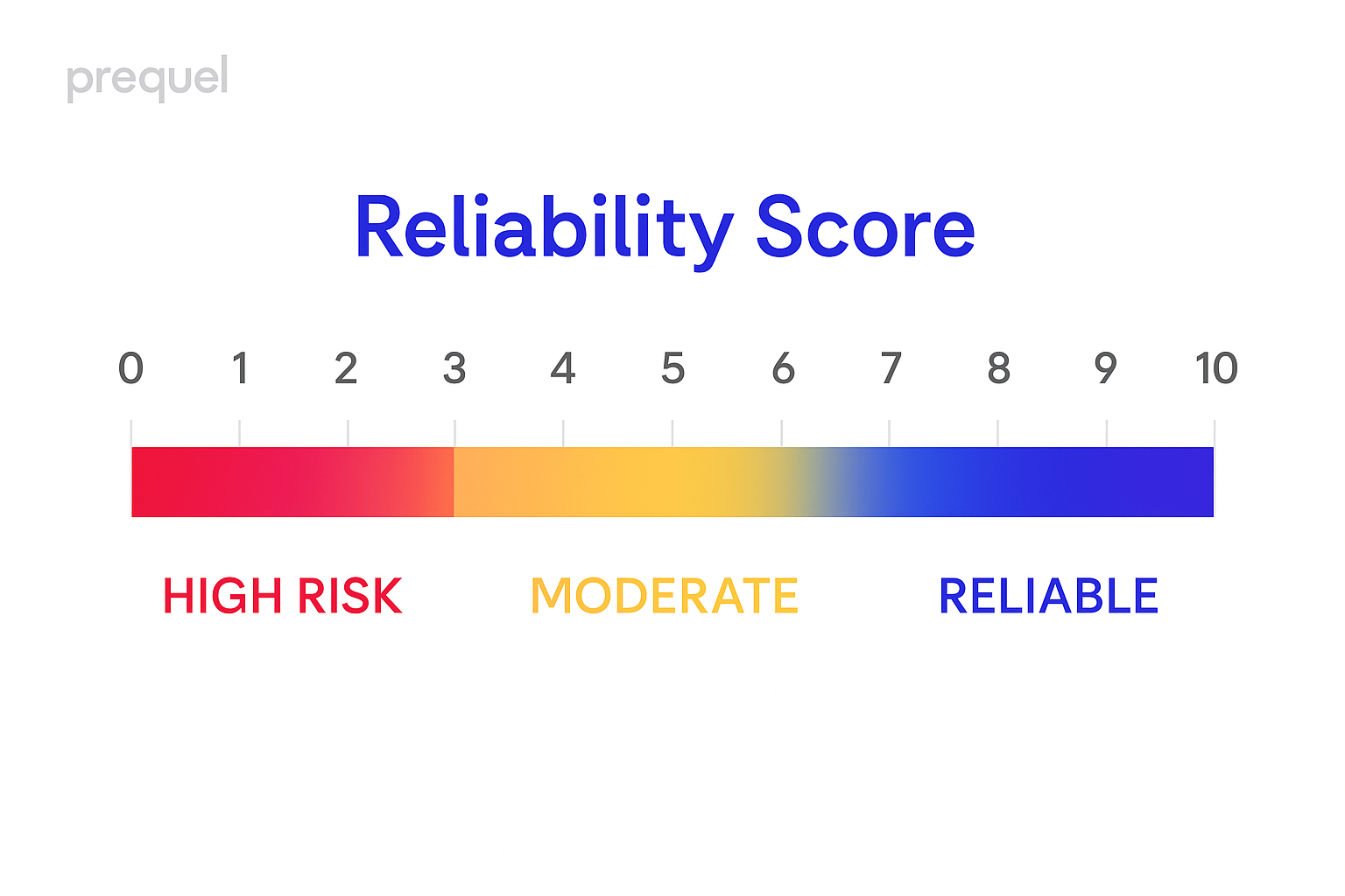
“Reliable” – Score of 7 or above (i.e., implementing at least ~75% of the scored practices). These charts have most of the important safeguards in place.
“Moderate” – Score of 4 to 6. These charts follow some best practices but lack others, indicating room for improvement.
“High Risk” – Score of 3 or below. Such charts miss the majority of reliability features, likely making them fragile in real-world conditions.
It’s important to note that a low score does not necessarily mean the software itself is bad; rather, it means the default Kubernetes manifests provided by the Helm chart might not ensure high availability or resilience. Users could still deploy those applications reliably by tweaking configurations (e.g., enabling HPA or increasing replicas), but out-of-the-box, the chart expose them to more risk.
For this report, we opted not to add weights to the various safeguards.
.png)
Overall Reliability Scores
Across the 105 Helm charts evaluated, the distribution of reliability scores was skewed toward the lower end. The mean score was ~3.98 out of 10, and the median score was 4, indicating that typically a chart only implements around four of the ten recommended reliability measures.
This overall low average suggests that many popular Helm charts do not incorporate a comprehensive set of reliability features by default.
.png)
To put these results in perspective:
- Only 18 charts (17.1%) scored in the “Reliable” tier, meeting 7 or more of the criteria. In fact, the highest score observed was 9/10 (no chart had a perfect 10). This means very few charts have almost all the best practices in place. The top scorers tend to be well-maintained projects that explicitly focus on robust deployments (examples are discussed later).
- 37 charts (35.2%) fell into the “Moderate” tier with scores 4–6. These charts include some reliability features but are missing many others. They might, for instance, have health probes configured but lack autoscaling and disruption budgets, or vice versa.
- 50 charts (47.6%) landed in the “High Risk” tier with a score of 3 or below.
Alarmingly, nearly half of the charts audited implement only a few (if any) of the reliability best practices. In fact, 10 charts scored 0, meaning they did not include a single one of the checked reliability features in their default manifests.
On the other hand, the relatively small fraction of charts in the “Reliable” tier demonstrates that it is feasible for a Helm chart to be shipped with strong reliability guardrails so this is an attainable goal for chart maintainers. The findings suggest that there’s significant room for improvement across the board, and users should not assume a chart is production-ready just because it’s popular.
In summary, the overall reliability state of Helm charts is moderate to poor, with a heavy tail of charts lacking critical features. Next, we delve into which specific reliability practices are most often absent, and which are more commonly implemented.
What’s Missing Most Often
.png)
Looking at the pass/fail rates for each of the 10 criteria gives insight into which reliability practices chart maintainers commonly omit. The following are the key criteria, ordered from most neglected to most adopted, along with the percentage of charts that failed each check in our audit:
Note: For capability-style criteria like PDB/TopologySpread/HPA, we count them as present if found either in the default render or under a minimal HA-capability render.
- Topology Spread Constraints – 93% of charts do not specify any topology spread constraints. This was the most glaring gap: only about 7% of charts had this configuration. Essentially, almost all charts do nothing to ensure pods are spread across multiple nodes or zones.
- As a result, if you deploy these charts, there’s a high chance all replicas could land on a single node by default, making the application vulnerable to node-level failures.
- Note: We didn’t score podAntiAffinity. While it can reduce co-location, it often over‑constrains scheduling and can slow recovery during drains/outages. We focus on topologySpreadConstraints (more expressive and preferred) and may surface podAntiAffinity as informational in future iterations.
- Horizontal Pod Autoscaler (HPA) – 75% of charts lack an HPA. Three out of four charts do not provide an automated scaling policy. This means by default those applications will run a fixed number of replicas regardless of whether the charts had this configuration. Essentially, almost all charts do nothing to ensure pods are spread across multiple nodes or zones.
- As a result, if you deploy these charts, there’s a high chance all replicas could land on a single node by default, making the application vulnerable to node-level failures. (We detect constraints both at the top level (spec.template) and in pod templates ( spec.topologySpreadConstraints.)load.
- If there’s a traffic surge or high workload, the application won’t scale out to handle it, potentially leading to performance degradation or downtime. In our evaluation, an HPA with minReplicas ≥ 2 is considered to provide redundancy; the low inclusion rate suggests many charts expect users to enable scaling themselves.
- PodDisruptionBudget (PDB) – 74% of charts do not define a PDB. This is another high-impact gap: roughly only one in four charts includes a PodDisruptionBudget. Without a PDB, there’s no built-in protection against voluntary disruptions.
- The fact that most charts omit this means they are prone to downtime during routine operations like node rotation or cluster upgrades, unless the user manually adds a PDB.
- CPU Limits – 63% of charts have no CPU limits on containers. Nearly two-thirds of charts do not cap CPU usage. While Kubernetes can still function without limits, the risk is that a container under heavy load could consume all CPU cycles on a node.
- This can cause noisy neighbor issues and even lead to other critical pods getting starved. The audit shows many charts leave this unchecked.
- Memory Limits – 60% of charts lack memory limits. Similar to CPU limits, a significant portion don’t set any max memory usage.
- Without memory limits, a memory leak or spike in one container can trigger an OutOfMemory condition on the node, potentially killing not just that container but others on the node as well. Memory limits contain the impact of such issues to the offending pod. The lack of limits in 60% of charts suggests a prevalent oversight, possibly because setting a one-size-fits-all memory limit is tricky and maintainers opt not to set any – but at the cost of reliability.
- CPU Requests – 51% of charts do not declare CPU requests. About half of the charts don’t reserve CPU for their pods.
- This means the scheduler doesn’t account for their CPU needs explicitly, which can lead to packing too many CPU-intensive pods on a node. Not having CPU requests can also degrade the effectiveness of autoscaling (HPA) because the HPA’s decisions often rely on knowing the CPU utilization relative to requests. The fact that ~49% do set CPU requests is a mildly positive sign.
- Memory Requests – 49% of charts have no memory requests. This is in roughly the same range as CPU requests (just a hair better). About half the charts don’t reserve memory.
- Without memory requests, the scheduler might place too many memory-hungry pods together. However, the other ~51% do set memory requests, which indicates that at least for half the charts, basic resource reservations are considered.
- Liveness Probes – 20% of charts lack a liveness probe. Here we see a much better adoption: 80% include liveness probes.
- This is encouraging, it suggests that the majority of chart maintainers recognize the importance of self-healing for their applications. The 20% missing probes might be either very simple apps that don’t need it (though almost every app benefits from a liveness check) or just oversights.
- Readiness Probes – 15% of charts lack a readiness probe. This was the most well-adopted criterion: about 85% of charts have readiness probes configured.
- Many chart authors seem to prioritize this, as it directly affects user experience during deployments/updates.
- Note: a portion of the remaining ~15% may not serve traffic directly (e.g., agents/Daemons without a Service, batch/cron jobs), so a readiness check may not be necessary for those workloads.
- PriorityClass – 15% do not specify any PriorityClass (thus pods run at default priority). This criterion is a bit different from others because not every app truly needs a custom priority; it’s more relevant for multi-tenant clusters or ensuring system-critical pods have higher priority.
- The low adoption isn’t as alarming as the others – it likely reflects that most charts use the default priority (which is fine for many cases). The 15% that do set a PriorityClass are usually charts for important infrastructure components (like ingress controllers, logging agents, etc.) where maintainers deemed it necessary to ensure those pods are less likely to be evicted or preempted.
In summary, the most commonly missing features were topology spread constraints, PodDisruptionBudgets, and autoscaling, each absent in well over 70% of charts. On the flip side, readiness and liveness probes were well-adopted by ~4 out of 5 charts, indicating that basic health monitoring is largely in place. Resource requests/limits showed a mixed picture – about half the charts enforce them, half don’t.
It’s worth noting that some charts might intentionally omit certain measures/settings expecting the user to configure them (for example, an autoscaler might be left out if the application’s scaling requirements vary widely between deployments). However, given Helm charts often aim to provide a reasonable default setup, it’s generally better to include these reliability features disabled or set to sensible defaults (which users can override) than to leave them out entirely.
These findings highlight areas where chart maintainers could improve:
- Implementing PodDisruptionBudgets would greatly enhance resilience during cluster maintenance.
- Adding Topology Spread Constraints (even a simple zone spread) would add high availability for multi-node deployments.
- Including an HPA (even off by default but available) would encourage autoscaling usage; setting minReplicas ≥ 2 under HPA provides redundancy.
- Setting resource requests/limits (perhaps conservative defaults) would promote more consistent performance and avoid resource contention issues[6].
- Exposing these controls as configurable values (with sensible defaults) raises the reliability baseline of the Helm ecosystem with minimal friction.
Reliability by Application Category
.png)
We grouped the charts into broad categories (based on the primary domain or function of the application) to see if certain types of applications tend to be more reliably configured than others. The categories included Monitoring/Logging, Security, Networking, Database, Storage, Streaming/Messaging, Integration/Delivery (CI/CD), AI/Machine Learning, and a few Uncategorized (for charts that didn’t clearly fit a single domain).
There were some noticeable differences in average scores across these groups:
- Streaming & Messaging – Charts in this category (e.g. Apache Kafka, Pulsar, RabbitMQ) had the highest average reliability score, around 5.3/10. This was the only category averaging above 5. A likely reason is that streaming systems are often stateful and critical, so their charts (especially Kafka’s and Pulsar’s) tend to incorporate features like PDBs and resource settings.
- Databases – Database charts (for systems like MySQL, PostgreSQL, MongoDB, etc.) also scored relatively well, averaging about 4.4/10. This was among the higher averages. Databases are stateful and often require careful handling of downtime, so we saw that many database charts include things like PDBs and requests/limits.
- Integration/CI-CD – This category (which includes things like Argo CD, Jenkins, GitLab Runner, etc.) had a moderate-to-high average around 4.2/10. It’s a small sample size, but notably charts like GitLab and Harbor (artifact registry, which we placed under integration/delivery) had decent scores (Harbor was 7, GitLab 7).
- AI / Machine Learning – This is an interesting category. We grouped various machine learning tool charts (like Kubeflow, MLFlow, etc.) here. The average was roughly 4.0/10, about on par with the global average. We had a mix: Kubeflow’s official chart scored 8 (very good), but some others like smaller ML tools scored low.
- Networking – Charts providing networking infrastructure (e.g. ingress controllers like NGINX, CNI plugins like Calico, service meshes, etc.) averaged around 3.9/10. This is just below the overall average. Many networking-related charts turned out to be missing a number of best practices. It’s somewhat surprising because one would expect networking components to be critical; the low scores might be because some networking daemons run as DaemonSets or have non-standard setups that our criteria didn’t fully apply to (or were just not configured with those features).
- Security – Charts for security tools (like Falco, cert-manager, external-secrets, etc.) averaged roughly 3.7/10. This was on the lower side. Notably, Falco’s chart scored 0 (it lacked all the features), which is surprising. This suggests reliability configuration hasn’t been a focus in some security tool charts, perhaps they assume a skilled operator will deploy and tune them, or just oversight.
- Storage – Storage system charts (e.g. Longhorn, OpenEBS, MinIO, etc.) were also below average, at around 3.6/10. It’s somewhat concerning because storage systems are stateful and critical; one might hope their charts are highly robust.
- Monitoring & Logging – This was the lowest-scoring category, averaging about 3.36/10. It also had the largest number of charts (since there are many monitoring/logging tools). A significant number of charts here had poor scores. Grafana Loki, however, was an outlier with a 9 (which helped a bit). It’s possible maintainers assume these tools run with a certain redundancy externally, or they simply haven’t prioritized the reliability of the monitoring system itself. The irony is that tools used to monitor reliability of other apps were themselves often not configured reliably by default.
- Uncategorized – We had a small set of charts we labeled uncategorized (miscellaneous). Their average was around 5.1/10, interestingly high. This bucket included things like some operator frameworks or bundles that didn’t fit elsewhere.
Overall, these category-based observations indicate that stateful services (databases, streaming) tend to have better reliability setups than many operational or add-on tools (monitoring, security). One reason could be that stateful applications demand careful handling (you can’t just casually restart a database without thinking of data consistency, etc.), so chart authors had to incorporate protections like PDBs. Meanwhile, things like metric collectors or log shippers, while also important, might be seen as easier to redeploy and thus chart authors were less strict about adding budgets or spreads.
These differences highlight that if you are deploying certain types of applications, you should be especially vigilant. For example, if you deploy a monitoring stack, double-check its chart for missing reliability configs (our data suggests it’s likely missing a few).
In short, while no category was perfect, some domains clearly lag in reliability configuration (monitoring/logging and some infra tools), and users should plan to fortify those charts themselves.
Top Performing Charts (Examples of Best Practices)
.png)
Despite the generally low scores overall, we identified a set of charts that serve as positive examples of how to package an application for reliability. These top performers managed to include most of the recommended best practices.
Here are a few notable ones:
- Grafana Loki – Score: 9/10. This was the highest scoring chart in our audit. Loki (a log aggregation system) had all but one of the criteria present. It defined resource requests/limits, had both probes, included an HPA, set a PodDisruptionBudget, and even topology spread constraints.
- Apache Kafka – Score: 8/10. Kafka is a critical streaming platform and its Helm chart scored very well. Included PDBs for brokers, resource requests/limits, and liveness/readiness probes.
- Keycloak – Score: 8/10. Keycloak (an identity management service) also was configured with many best practices. It had health probes, resource management, PDB, etc.
- Pulsar – Score: 8/10. Apache Pulsar, another streaming platform, did excellently as well. Similar to Kafka, its chart includes comprehensive settings. The Pulsar chart actually consists of multiple components (broker, zookeeper, bookkeeper), each handled carefully with appropriate configs.
- Kubeflow – Score: 8/10. Kubeflow (the machine learning toolkit) had an official chart that scored high. This is interesting because Kubeflow is a very complex system. Multiple services configured with PDBs, resource requests/limits, and liveness/readiness probes; HPA is supported on components that can scale.
- Sentry – Score: 8/10. Sentry (error tracking platform) also was among the top. Sentry being an operational tool that teams rely on, it’s good that its helm chart tries to keep it highly available (for example, ensuring the web and worker pods have proper probes and budgets).
- GitLab – Score: 7/10. GitLab’s chart (particularly the omnibus or the cloud-native GitLab chart) scored in the reliable tier as well. Given the number of sub‑components, this reflects broad coverage of probes, resource controls, and PDBs, with two criteria not satisfied in our scoring.
- OpenEBS – Score: 7/10. OpenEBS (a storage orchestrator) was a bright spot in the storage category, scoring 7. It Included PDBs (important for data pods) and resource controls; a stronger showing within the storage category. It stands in contrast to Longhorn’s chart (which scored 0), showing not all storage projects neglect reliability.
- Harbor – Score: 7/10. Harbor (container registry) is another complex application that scored well. PDBs and resource settings were present across core components (database, core, job service, etc.).
These top charts illustrate that high reliability scores are achievable. They typically come from either: well-known companies/communities that enforce good devops practices in their charts (e.g., Grafana on Loki), or inherently critical software whose maintainers know the users will demand a resilient setup (databases, security/auth services, etc.).
Poorest Scoring Charts
.png)
On the other end of the spectrum, we saw quite a few charts with minimal or no reliability features. It’s important to highlight some of these not to single them out for blame, but to illustrate common patterns of omission and to caution users of these charts to take extra care.
Here are a few of the lowest-scoring examples:
- Falco – Score: 0. Falco is a popular security monitoring tool (runtime security). Surprisingly, its Helm chart did not include any of the checked reliability configurations. Users of Falco should be aware that they might need to add their own reliability settings. It’s a classic case where perhaps the focus was on the functionality of the tool, and the chart packaging received less attention to reliability.
- Note: Deploys as a DaemonSet by default; PDB/TopologySpread/HPA/Replicas are N/A.
- Longhorn – Score: 0. Longhorn is a cloud-native distributed storage solution. A zero score here is concerning because storage systems are complex and not having (for example) a PodDisruptionBudget for the storage pods could lead to data unavailability during maintenance.
- Note: Mixed workloads (Deployments/StatefulSets/DaemonSets). DS components won’t use PDB/Spread/HPA;
- Fluent Bit – Score: 0. Fluent Bit is a log forwarding agent. Its chart scoring 0 indicates it likely runs as a DaemonSet with no added frills. Logging pipelines are critical for SRE observability, so keeping them reliable is important.
- Note: Deploys as a DaemonSet by default; PDB/TopologySpread/HPA/Replicas are N/A.
- Calico (Tigera Operator) – Score: 0. Calico is a networking CNI for Kubernetes, and it often runs via an operator.
- Grafana Alloy – Score: 0. Grafana “Alloy” is a lesser-known component (possibly a plugin or sidecar). It scoring 0 again emphasizes that even within a known vendor’s ecosystem, not every chart is equal, Loki’s was excellent, but this one was not.
- Note: Typically runs as a DaemonSet for node telemetry; apply DS caveats (PDB/TopologySpread/HPA/Replicas are N/A).
- Prometheus Node Exporter – Score: 0. The node-exporter chart (listed as part of prometheus-community) also had none of the reliability features. Node-exporter runs as a DaemonSet on each node to collect metrics. Similar to Fluent Bit, running as DaemonSet might have led maintainers to not include budgets or autoscaling (since those don’t apply the same way)
- Note: Deploys as a DaemonSet by default; PDB/TopologySpread/HPA/Replicas are N/A.
- Actions Runner Controller – Score: 0. This is a chart for a GitHub Actions self-hosted runner controller. It scoring 0 means it lacks any reliability config; as an operator-like component, it probably wasn’t given PDBs or special priority.
- AMD GPU and Intel GPU plugins – Score: 0. We saw charts for GPU device plugins (for AMD and Intel GPUs) also with zero scores. These are deployed as DaemonSets to advertise GPUs to the cluster. They had no reliability features in charts, which might be because they’re expected to be super lightweight.
- Note: Deploys as a DaemonSet by default; PDB/TopologySpread/HPA/Replicas are N/A.
- Note: Deploys as a DaemonSet by default; PDB/TopologySpread/HPA/Replicas are N/A.
In total, we had 10 charts with 0 scores (some we described above). Many others were just slightly above 0 (score 1 or 2).
Common patterns among low-scoring charts:
- Many are infrastructure add-ons (operators, agents, plugins) rather than end-user applications. It seems chart maintainers for these system-level tools often keep the chart minimal.
- DaemonSet workloads - Several 0‑score charts are DaemonSets (e.g., Fluent Bit, node‑exporter, GPU plugins). For DS, controls like PDB/TopologySpread/HPA/Replicas are generally not applicable; what matters is CPU/Memory requests and limits, Liveness probes, PriorityClass, and DS rollingUpdate settings.
- Relatively newer or niche projects - Some low performers are not as mature or widely used, perhaps, so their charts haven’t undergone rigorous production-hardening by the community.
For users, the takeaway is: if you are using one of these low-scoring charts (or any chart that hasn’t clearly advertised its reliability features), do not deploy it blindly in production.
At a minimum, consider:
- Checking carefully the values to define PodDisruptionBudget, Topology Spread Constraint and HPA wherever applicable.
- Setting resource requests/limits via values overrides.
- Adding an HPA (if the app would benefit from scaling).
- Ensuring you attach liveness/readiness probes (maybe via chart values or a side patch if not supported natively).
- If it’s a critical infrastructure component, possibly assign it a PriorityClass to avoid eviction (for example, set it to the system-cluster-critical priority if appropriate, or create a custom one).
Basically, use the findings here as a checklist against any Helm chart you deploy: check if it has these items, and if not, you might need to supply them.
.png)
Conclusion and Recommendations
This reliability audit of Helm charts has revealed a sizable gap between the reliability best practices that we know are important and what is actually implemented in many Helm charts today. While a few charts exemplify excellence in configuration, the majority have significant room for improvement. At the same time, we acknowledge that different use cases require different safeguards.
In closing, we summarize recommendations for both chart users (operators) and Helm chart maintainers to act on these insights, and how tools like Preq/Prequel can assist in catching unmitigated risks.
For Chart Maintainers:
- Embed Reliability Best Practices by Default: If you maintain a Helm chart, consider this an encouragement to bake in more of these features. These should be part of the “standard equipment” of your chart.
- Provide Autoscaling Options: Where applicable, provide an HPA in the chart (it can be off by default, but ready to enable). This signals to users that your application supports scaling and encourages them to use it.
- Don’t Skimp on Probes: Ensure every long-running pod has a liveness and readiness probe defined. This is one area many charts did well, and all should. It significantly increases resiliency
- Set Resource Requests/Limits: We recognize that picking default resource values can be tricky (since workloads differ), but providing reasonable defaults is better than none.
- Use PriorityClass for Critical Components: If your chart is for a system-critical service (operators, controllers, ingress, etc.), consider assigning a high PriorityClass (or at least make it configurable).
- Test Disruption Scenarios: As a maintainer, test how your chart behaves during common scenarios: node drains, upgrades (in case of stateful applications if someone does helm upgrade, do all pods restart at once?), high load (does CPU spike and if so, is HPA there to help?), etc. This experiential testing can highlight missing pieces.
- Leverage Community Standards: The Kubernetes community (and projects like the CNCF) often provide guidelines or even boilerplate for these configurations. Following these guides can serve as a checklist for your chart.
- Document appropriately: Clear and comprehensive documentation is essential for helping end-users configure reliability settings that align with their specific needs and operational constraints. Good documentation not only enhances the experience for maintainers but also ensures a smooth experience for end-users.
For Helm Chart Users (Deployers):
- Review Charts Before Production Use: Do not assume a Helm chart is production-ready. As this audit shows, many are not, in terms of reliability. Before deploying, audit the chart’s values and manifests yourself.
- Override and Augment Configurations: The beauty of Helm is you can supply custom values. Use this to your advantage.
- Consider writing an overlay chart or a wrapper that adds missing pieces.
- Note: overlays/wrappers break the “least knowledge” principle. You can’t rely solely on upstream SemVer/upgrade notes. Treat it like a maintained fork.
- Contribute Back Improvements: If you as a user had to add reliability configs to make a chart stable, consider contributing that back to the chart’s repository (submit a pull request or issue). Prefer upstreaming first; use overlays only when upstream changes are not feasible in the short term.
- Use Detection Tools: Consider using tools that can scan your cluster or manifests for missing best practices, essentially doing what this audit did, but for your environment. Tools like Prequel (start for free) can be integrated into CI pipelines or run against your Helm releases continuously to flag if, say, a new deployment is missing a liveness probe or PDB. In an enterprise setting, Prequel could be set up as a guardrail: whenever a new chart is deployed, it checks the CRE rules and alerts if something critical is absent. This kind of automation ensures that even if a maintainer hasn’t provided a feature, you catch it before it causes an incident.
The Role of Continuous Reliability Protection: Finally, it’s worth re-emphasizing the value of continuous monitoring using tools like Prequel. Just as security scanning of images and CVEs has become a standard part of DevOps, reliability scanning is emerging as a complementary practice. By leveraging the CRE rule set (which encapsulates knowledge of failure patterns), teams can detect misconfigurations and other problems early.
The journey to reliable Kubernetes deployments is a shared responsibility between chart creators and users. Helm charts are a powerful vehicle for distributing applications, but they should carry not just the app itself, but also the wisdom of running it reliably. Our research is designed to bring awareness to the risk so that teams can fully embrace that philosophy. By implementing the recommendations above, we can collectively raise the reliability bar.
- [1] Prequel Documentation
- [2] [3] [4] [7] Post 2/10 — Reliability by Design: Probes, PodDisruptionBudgets, and Topology Spread Constraints - DEV Community
- [5] Services, Load Balancing, and Networking
- [6] [8] Kubernetes Best Practices for Reliability
- [9] IBM Cloud Docs
- [10] Horizontal Pod Autoscaling | Kubernetes


